In addition to standard form inputs, Allegro applications also use components developed specifically for Allegro Framework.
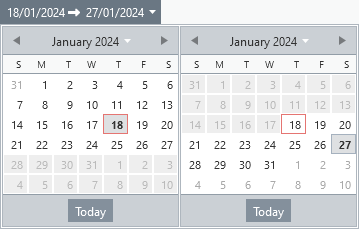
This is an input field for entering the period from date to date.
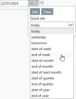
Relative Date
Another component for date input. It is used to enter a date relative to today's date. Clicking the shortcut button opens a predefined list of shortcuts. The specific offset can be set by clicking the Edit button.
Multilingual Input
Allegro Framework supports multilingualism not only on the user interface but also on the data level. Two special components - simple and multi-line text input fields - have been created for the insertion of texts that are expected to require language mutations. This unique feature of Allegro applications is used, for example, when printing a document, where the usual requirement is a complete translation of all text according to the language of the recipient. This means not only the static ones (labels in the document, header, footer, ...), but also, for example, product names, department names, tax rate names and so on.

Simple input field

Multi-line input field
Combo Box With Record Management and Search
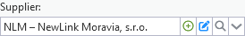
Another component created specifically for Allegro applications is a combo box (a text box with a list of options) extended with additional tools. This element is always connected to a specific source of records, which are then offered in the drop-down list and thus form a limited set of input field values. By entering the initial letters of the search value, a drop-down list with found items opens, in which you can move using the arrows and the Enter key confirm selection.
|
Create a new record. The form for inserting a new record opens. After saving, it will be automatically added to the combo box list and pre-filled in the input field. |

|
Edit the selected record. The form with the loaded record will open. If a change to the values displayed in the combo box is saved, it is automatically updated in the input field. If no value is selected (combo box field is empty), no action is performed. |

|
Advanced search. A list of the application used as the source of the combo box entries will open. The selected record (double-click or Enter key) is automatically inserted into the input box. |

Grid
It is a form component for inserting and editing data grouped into rows and columns. Activation of the component is done by clicking on any cell of the grid or by using the Alt+Q keyboard shortcut (for other grids on the form use W, R and T). It is possible to move between rows using the down and up arrows, and between columns of the row by using the right and left arrows.
If the cell is editable, the corresponding input field is offered after pressing Enter or clicking the mouse. Pressing the Esc key exits editing and the field is replaced with the standard cell value display. The editing components are identical to normal form input fields.
The same rules apply to row selecting as for the list.
For grid columns the same options as for list columns apply, but without the filtering possibility.
To insert a new row or remove selected rows, there are two buttons available - Add Line and Delete Selected Lines. Corresponding Ctrl+Insert and Ctrl+Delete keyboard shortcuts can also be used. In some applications, the standard grid toolbar is replaced by buttons with special functions.
Unless a custom ordering of rows is selected in the application (e.g. alphabetical for the selected column), they are displayed by default according to the order in which they were inserted into the grid.

Simple grid with standard toolbar
Where necessary (e.g. for documents such as quotes, invoices, ...), the grids are equipped with the ability to change the order of the rows by drag and drop.
For selected applications, state monitoring is enabled, i.e. registration of changes made by the user in the grid layout (order and width of columns, their order and visibility) and saving these changes for each individual application in the database. If saved changes are detected for the grid, the Restore Layout button is made available. When clicked, a message will appear announcing the deletion of the saved state, but this will only take effect after opening the application again.

Grid with custom toolbar and saved state
Predefined Texts
Component for inserting frequently used texts. You can manually enter any text into the input field or select one of the preset (saved) texts.

Clicking on the attached button opens a panel with a list of saved texts, allowing you to enter the selected content into the input field by pressing the Enter key or double-clicking the mouse. The inserted text is added to the input field after an existing value and the resulting text can be subsequently changed as required.
Predefined texts are stored in the database according to their type assigned by the application logic. Thus, texts created and stored in two different applications are only shared if they share the same type.
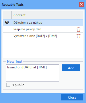
The macros [DATE] and [TIME] can be used in texts (not case sensitive), which are replaced by the current date and time when inserted into the input field.
If the text is marked as public, it is shown to everyone, indicated by an icon in the list. Otherwise, it is only visible to the user who created and saved the text.
Only custom texts (created by the user) can be deleted, either by clicking on the trash can icon or by pressing the Delete key.
For authorised persons, there is also an application that allows all saved texts to be managed centrally, i.e. create, edit or delete.
File Attachment
Allegro Framework includes a unique file manager that allows you to create and manage a custom directory structure for all files that Allegro applications work with. Among other things, it offers automatic storage of scanned documents, downloaded bank statements, rate tickets or email attachments sent to designated addresses. These files are then offered in Allegro applications for attaching to records (e.g. scanned invoices, production documents, product photos, ...) or for further processing (e.g. bank statements, data to be imported, ...).
A component was developed for assigning various file types to individual records, allowing the selection of available files and displaying a list of them together with a preview option. In some applications, this list is extended with a column containing the date and time the file was attached to the record and the name of the user who performed the action. The preview options vary depending on the type of file being displayed (e.g. there is no toolbar for images).
Double-click the file name to download it. By simply clicking on the second column of the list or pressing the Enter key, the selected file can be annotated.
The down and up arrows can be used to move between the rows of the attached files, and the right and left arrows can be used to move between the columns of the row.
The same rules apply to row selecting as for the list.

List of attached files and their preview
|
Open a window for selecting a file and attaching it to a record. |

|
Download the marked files as a ZIP archive. The button is only enabled if more than one row is selected. |

|
Primary file indicator. File is then preferentially offered when working with the record afterwards. The button is only enabled if only one row is selected. |

|
Remove marked files. The files are not deleted and remain available in the file manager, only the reference to the record is removed. |

Selecting Files to Connect
The selector, which is the file manager opened in the window after clicking the Add button (see above), is used to select files to attach. The same rules apply for moving around in the selector as for the manager itself, including keyboard shortcuts. The only exception is double-clicking or pressing Enter on the file line - in the selector, the file is appended to the data record, while in the manager, the file is downloaded. When using the Enter key, multiple files can be selected and attached at once.
The same rules apply for selecting rows with files as for the list.

Selecting files to attach to the record